

Moss green and kraft wedding invitation
Today I would like to talk about the very first wedding invitation I’ve realized. It’s been about 2 years since I designed them, but they always have a special place among my jobs.
So, the first wedding invitation of my carrer was made for my syster’s wedding. Yes, as you know she got married and how could I have delegate to someone else the task to follow her during the preparation?
It was the very first wedding I took care of, and thanks to that I literally fell in love with this world.
As I’ve already told you several times the wedding invitation have the task to transmit to the guests the athmosphere that the bride and groom have in mind for the day. For that it’s quite important to have clearly defined ideas before throw yourself into the job.
My first advice is to start to enter into the fantastic world of “Pinterest” (A content sharing service that allows members to “pin” images, videos and other objects to their pinboard.) . This could sound restrictive but it a fantastic world where you can find a lot of images, pictures related to an huge amount of themes.
Create your own board and start to “pin” all the pictures or images that more reflect your savor. It’s an importat job in my opinion because allow you to focus on what you really like avoiding to forget about it.
For Eleonora and Stefano the mood identification was quite simple. One of the first choices they made was to do the reception in an agritourism in contact with nature and enjoying the high quality local food
An informal and bucolic environment. This aspect gave us the fist idea on the athmosphere there was going to be.
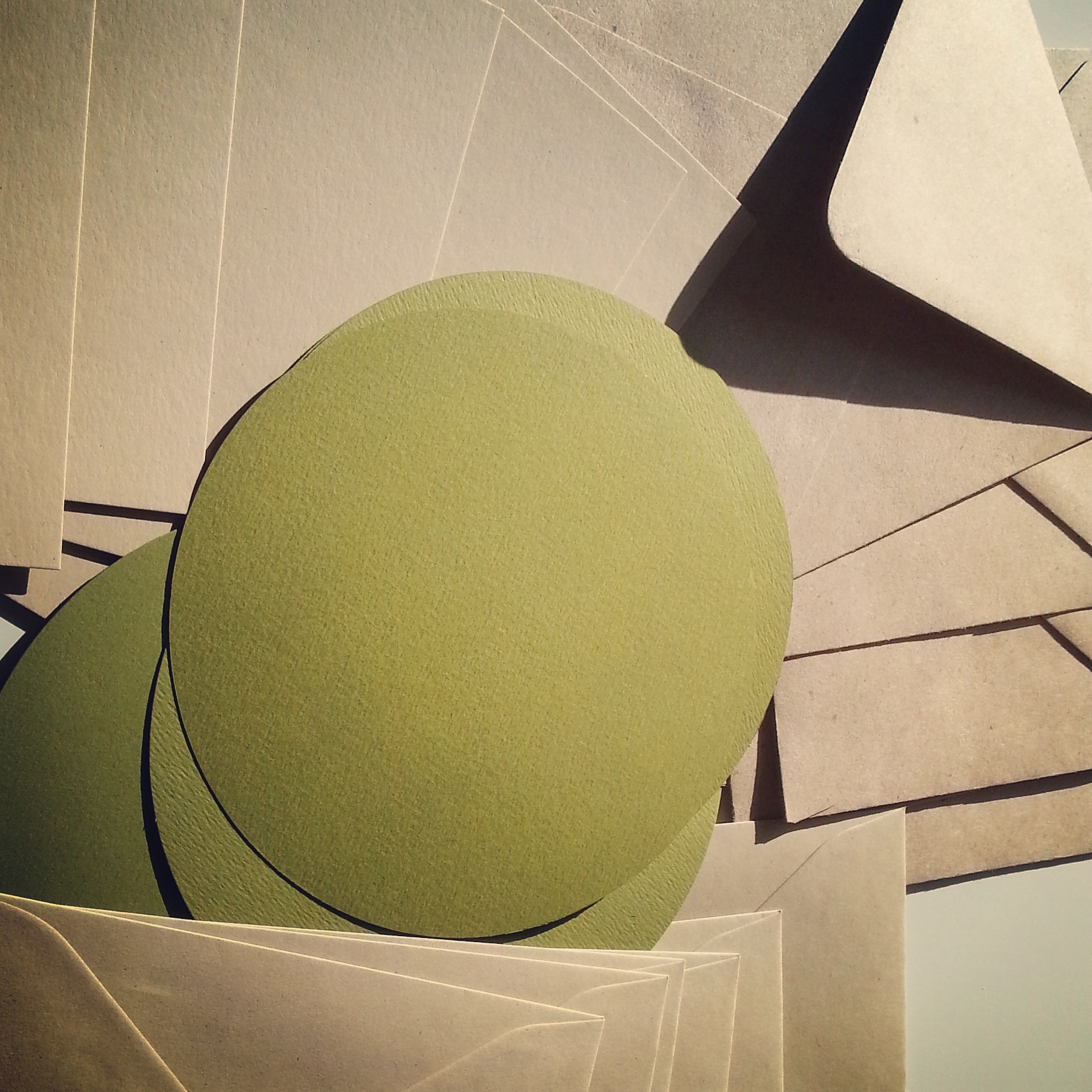
The next choice was the primary color: green since my sister always liked it.
We chose a shade of green, moss green, and we combine it with a kraft card and rope. I think this pair made the point on the idea we wanted to transmit.
Then, as I used to do for the wedding invitation, I focused the job on the logo creation. I used their name to create a sort of recursive motif to use on all the stuff we printed. I chose a calligraphic font, like an handwriting font. To this font we pair a sans serif for all the other text.

We then chose a square shape and the distinctive tract of these wedding invitation is that we decided to stamp it instead of print it.

What do you think? do you like them?


