

Tiffany and kraft wedding invitations
Today I tell you about another job of mine. These wedding invitations have been studied like all my projects starting from the study of a personal brand for the fiancés.
The logo was inspired to the alphabet, where their initial letters are closed each other. A wish to stay always together, like their initials.
At the same time of the logo has been studied the color palette.

The crucial point for the bride was the tiffany color to use for all and a choice to a rustic wedding atmosphere.
From these starting points borns the color palette, with the tiffany obviously, but in combination with acquamarine, kraft and ecrù colors.
Then I suggested the DL size, or rather 11 cm x 22 cm. I choose this size because is clearly elegant, and used in vertical I found them really modern.
The rustic’s but refined touch of these invitations is guaranteed by the envelope, with a japanese closure, in kraft paper. I find them really beautiful.
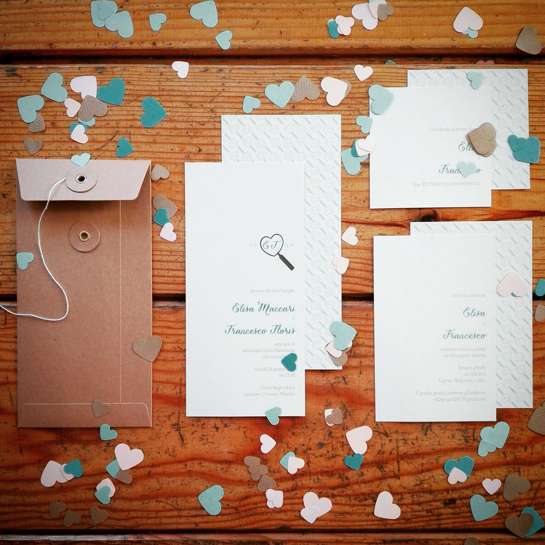
Since all the informations are positioned on the front of the card, we decided to treat the back with a pattern, studied for them, printed lightly as a background.

What do you think? Do you like them?


