[:it]Colore dell’anno 2016 (ovviamente secondo PANTONE!)[:en]Color of the year 2016 (for PANTONE obviously!)[:]
[:it]Ieri Pantone ha ufficialmente annunciato il colore dell’anno 2016 e… per la prima volta non viene presentato un solo colore, ma ne troviamo due!
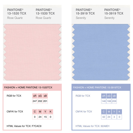
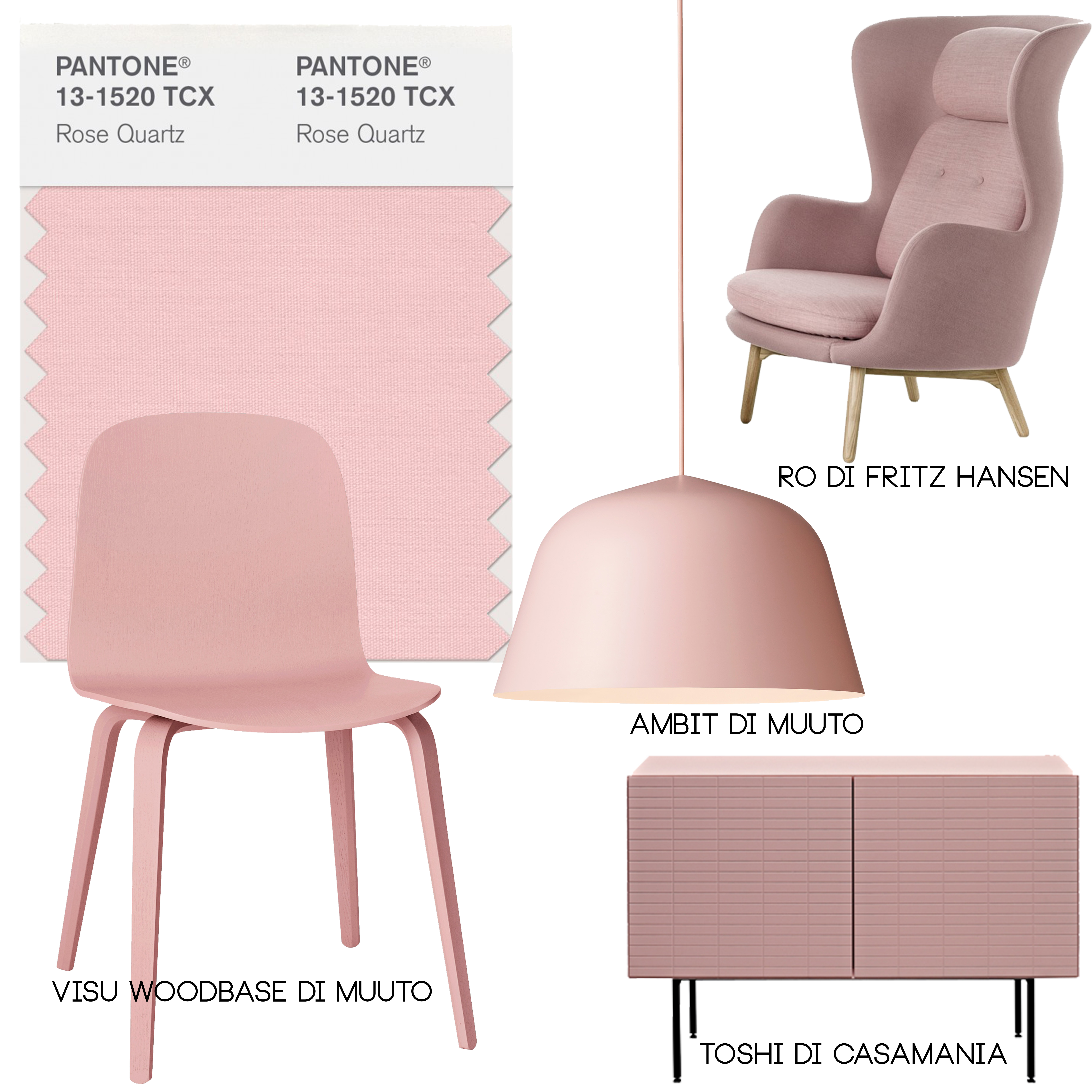
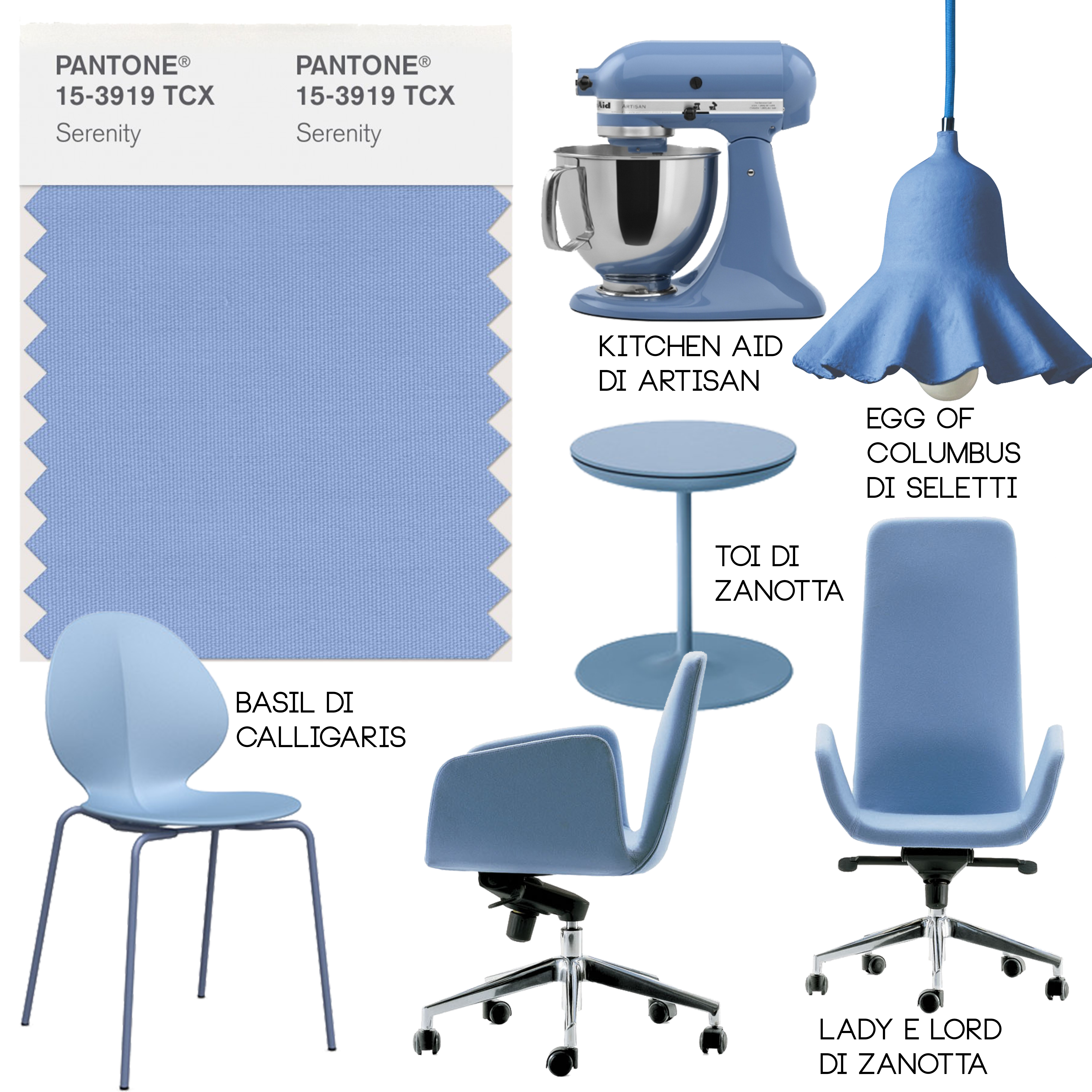
I colori scelti sono Rose Quartz e Serenity, due bellissime sfumature di rosa e azzurro molto eleganti insieme.

Questa scelta va un po’ contro tendenza rispetto ai colori degli anni passati, molto più vivaci, e sicuramente non pastello.
Un un comunicato stampa di Pantone descrive i colori come atti a “indurre sensazioni di stabilità, costanza, comfort e relax”, e sostiene che essi “creano equilibrio in un mondo caotico”.
Sempre citando PANTONE: il Rose Quartz è un tono dolce ma persuasivo che trasmette la compassione e un senso di compostezza. Il Serenity è leggero e arioso, come la distesa del cielo blu sopra di noi, portando sentimenti di tregua e relax anche in tempi turbolenti.
Beh visto come stiamo entrando nel 2016, e tutto quello che succede intorno a noi mi piacerebbe davvero molto che due colori avessero il potere di portare un po’ di tregua, compassione e senso di compostezza in questi tempi turbolenti. Sarebbe sicuramente un ottimo traguardo.
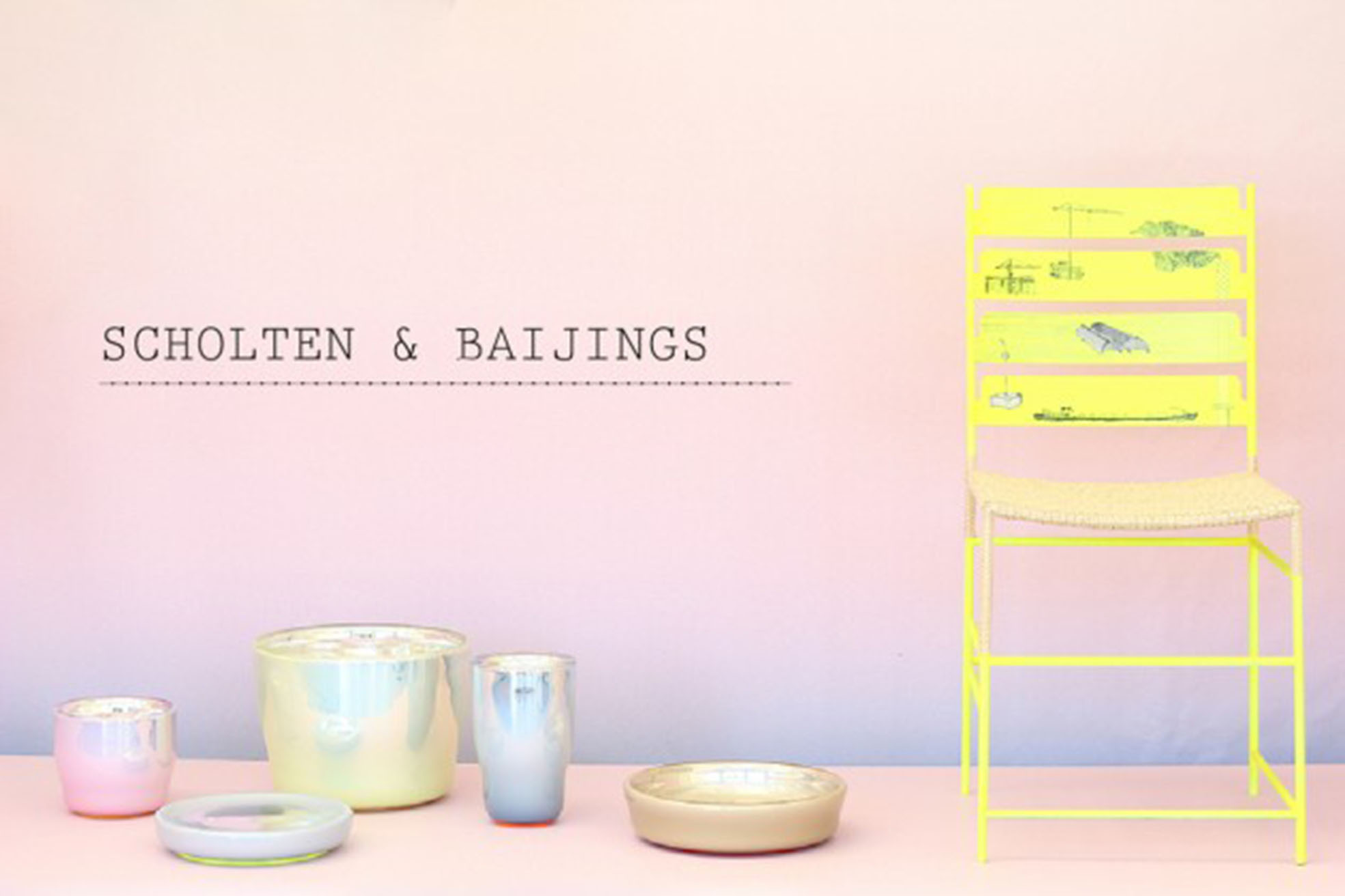
Guardate la foto di questa mostra del 2014, realizzata da Scholten & Baijings a Villa Noailles, opportunamente chiamata “Over the Rainbow”. Non la trovate anche voi “premonitrice”?
Vi ho preparato due “abachi” di arredi che già sfruttano queste tonalità di colore.
Rose Quartz:
Serenity:
Cosa mettereste in casa vostra?
Se invece vorreste pitturare direttamente le pareti di questi colori vi interesserà sapere che PANTONE ha due partner ufficiali, ovvero MaxMayer e Tollens, che nel loro catalogo hanno già inserito i colori dell’anno 2016.

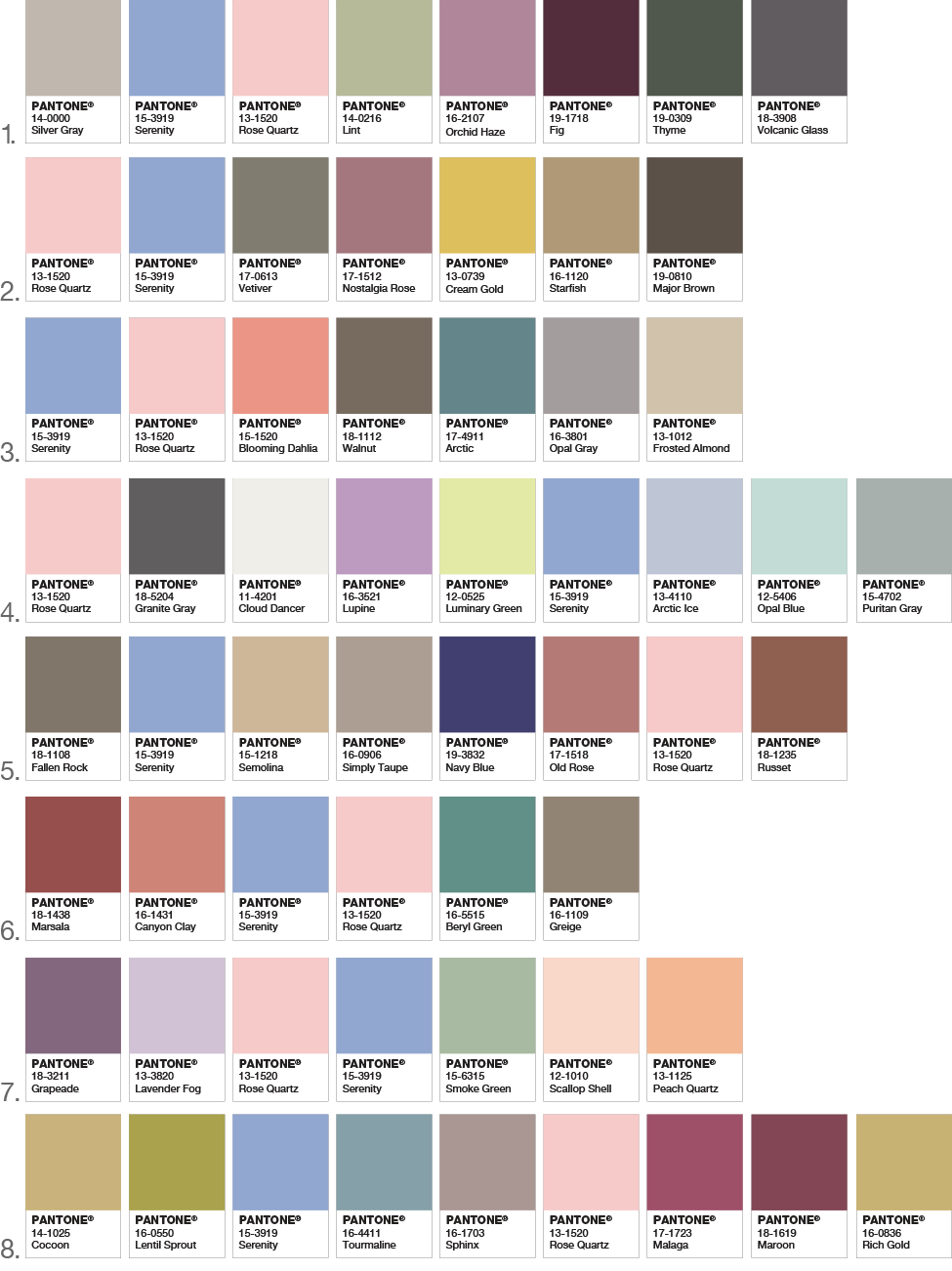
Pantone ha inoltre fornito delle palette di possibili abbinamenti.
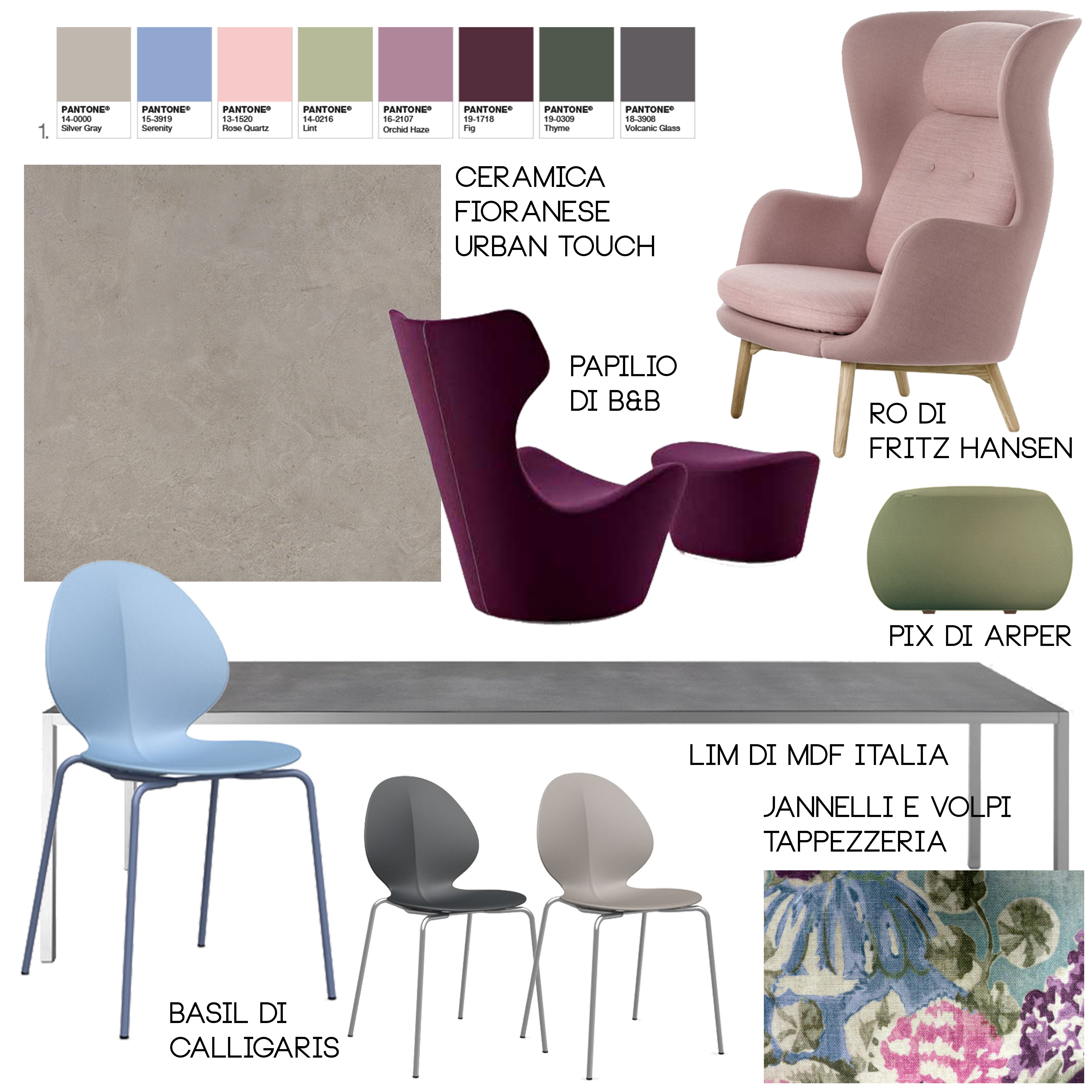
Vi ho preparato un’immagine di come io userei la prima!
E a voi piacciono questi colori? Che palette preferite?[:en]Yesterday Pantone has formally proclaimed the color of the year 2016 and… for the first time is not only one color, but two!
The colors chosen are Rose Quartz and Serenity, two beautiful shade of pink and light blue really elegant together.
This choice goes against the trend respect previous years when the colors were much more lively and surely not pastel.
Pantone’s news release describes the colors as “inducing feelings of stability, constancy, comfort and relaxation,” and argues that they “create balance in a chaotic world.”
Considered how we are entering in 2016, and all that’s happen around us, I really like that two colors had the power to bring a little of respite, compassion and a sense of composure in this turbulent times. It would be surely an excellent goal.
Look this picture of the exibition of 2014, curated by Scholten & Baijings in Villa Noailles, called “Over the Rainbow”. You don’t find it “prophetic”?
I prepared you two images with the furnitures that use this shades.
Rose Quartz:
Serenity:
What will you put in your home?
If instead you prefer paint your walls of this tone, you’ll be interested to know PANTONE has two official partners: MaxMayer and Tollens, that in their catalogues has just inserted the colors of the year 2016.
Pantone has provide different palettes with possible combinations.
I have prepared an image about how I’d use the first.
Do you like these colors? How is you favorite palette?[:]