[:it]Partecipazioni tiffany e kraft[:en]Tiffany and kraft wedding invitations[:]
[:it]Vi presento oggi un altro mio lavoro. Queste partecipazioni, realizzate per una coppia che si sposerà in estate, sono nate come tutti i miei lavori dalla creazione di un logo personale per gli sposi.
Il logo studiato per loro si ispira all’alfabeto e alla vicinanza delle prime lettere dei loro rispettivi nomi. Una sorta di augurio a stare sempre uno accanto all’altro, così come lo sono le loro iniziali.
Contestualmente al logo è stata pensata la palette colori.

I punti fermi degli sposi erano la scelta del color tiffany come colore guida di tutto il matrimonio, e la volontà di un matrimonio “rustico” nella sua accezione più elegante. Ok, sembra un paradosso messa così, ma l’idea era quella di ricreare un’atmosfera informale, molto conviviale, dove non fossero necessari suppellettili brillanti o sfarzosi.
Da questi spunti nasce la palette colori, che accoglie ovviamente il tiffany ma in abbinamento con l’acquamarina, il kraft e il corda.
Per queste partecipazioni ho proposto il formato DL, ovvero 11 cm x 22 cm. La scelta è ricaduta su questo formato perché indubbiamente elegante, inoltre usato in verticale anziché in orizzontale lo trovo molto moderno.
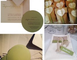
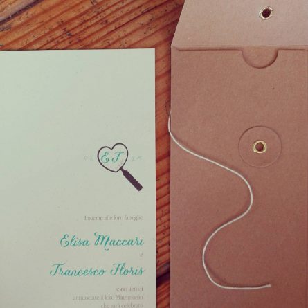
Il tocco “rustico ma ricercato” di queste partecipazioni è dato dalla scelta della busta, in carta kraft e con chiusura giapponese. Io le trovo bellissime.
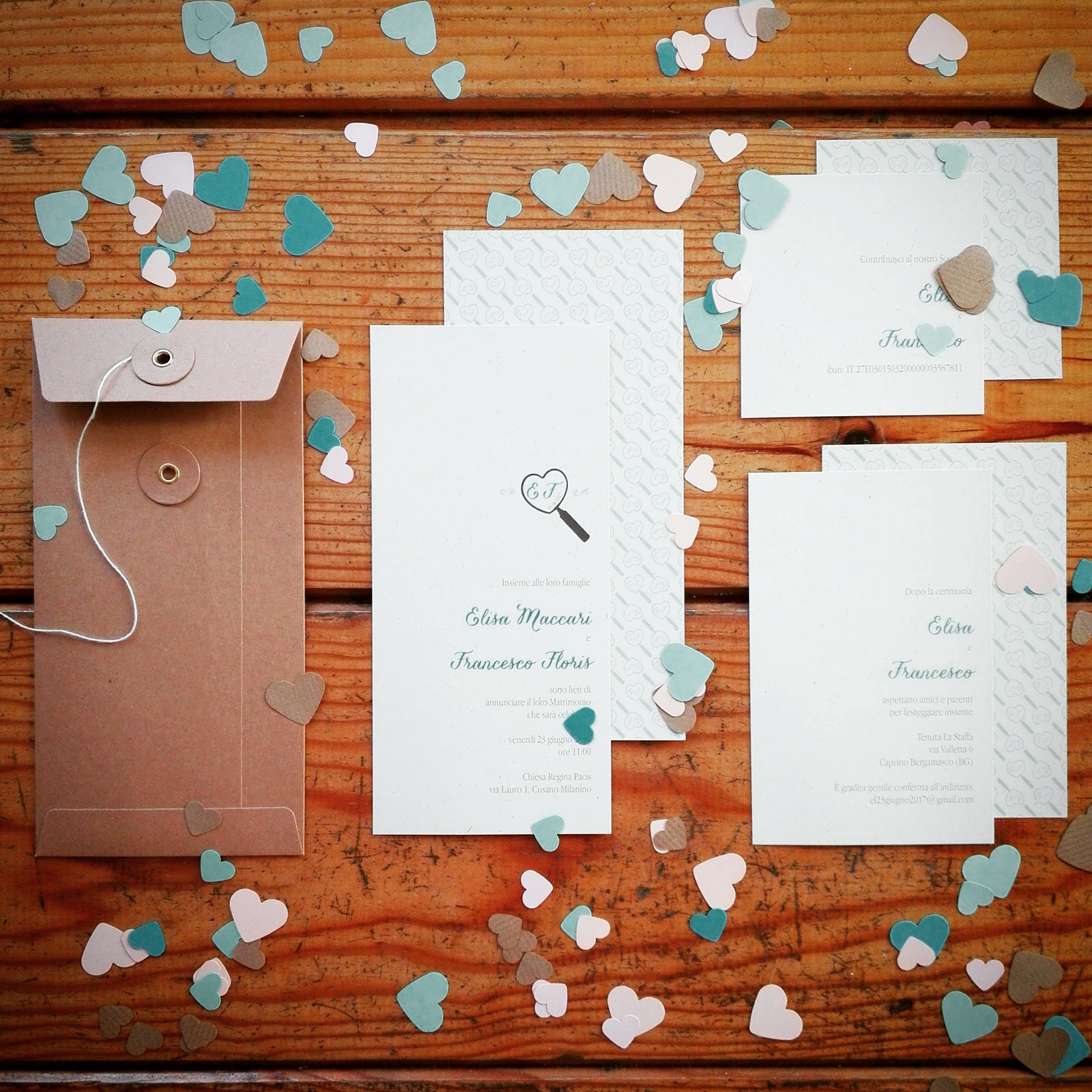
Poiché tutte le informazioni sono state posizionate sul fronte dei cartoncini, abbiamo deciso di trattare il retro con un pattern, ovviamente studiato ad hoc per loro, nato dall’intreccio del loro logo, stampato molto chiaro come sfondo della cartolina.

Che ne dite, vi piacciono?[:en]Today I tell you about another job of mine. These wedding invitations have been studied like all my projects starting from the study of a personal brand for the fiancés.
The logo was inspired to the alphabet, where their initial letters are closed each other. A wish to stay always together, like their initials.
At the same time of the logo has been studied the color palette.
The crucial point for the bride was the tiffany color to use for all and a choice to a rustic wedding atmosphere.
From these starting points borns the color palette, with the tiffany obviously, but in combination with acquamarine, kraft and ecrù colors.
Then I suggested the DL size, or rather 11 cm x 22 cm. I choose this size because is clearly elegant, and used in vertical I found them really modern.
The rustic’s but refined touch of these invitations is guaranteed by the envelope, with a japanese closure, in kraft paper. I find them really beautiful.
Since all the informations are positioned on the front of the card, we decided to treat the back with a pattern, studied for them, printed lightly as a background.
What do you think? Do you like them?[:]