[:it]Restyling di un logo: Il Cappellaio Matto[:en]Brand identity restyling: Il Cappellaio Matto[:]
[:it]Quasi ormai un anno fa un caro amico mi ha chiesto di ripensare al logo per la sua attività, e oggi vorrei mostrarvi il lavoro fatto.
Non ci ho messo un anno, sia ben chiaro, solo non ho ancora pubblicato il lavoro svolto sul blog.
Il Cappellaio Matto è un’agenzia di animatori, principalmente per piccoli ma che sta da poco iniziando a rivolgersi anche al pubblico adulto.
Sono un gruppo, piuttosto numeroso, di giovani animatori, che con la loro fantasia e giovialità contribuiscono a rendere un po’ più speciali molte feste.
La realtà di cui vi sto parlando opera nel territorio del Varesotto dal 2010, quindi si era già costituita un’identità piuttosto forte, che ha reso necessario un restyling dell’immagine netto ma che non andasse a stravolgere completamente i cardini su cui era cresciuta.
Il logo di partenza su cui ho iniziato a lavorare era questo:
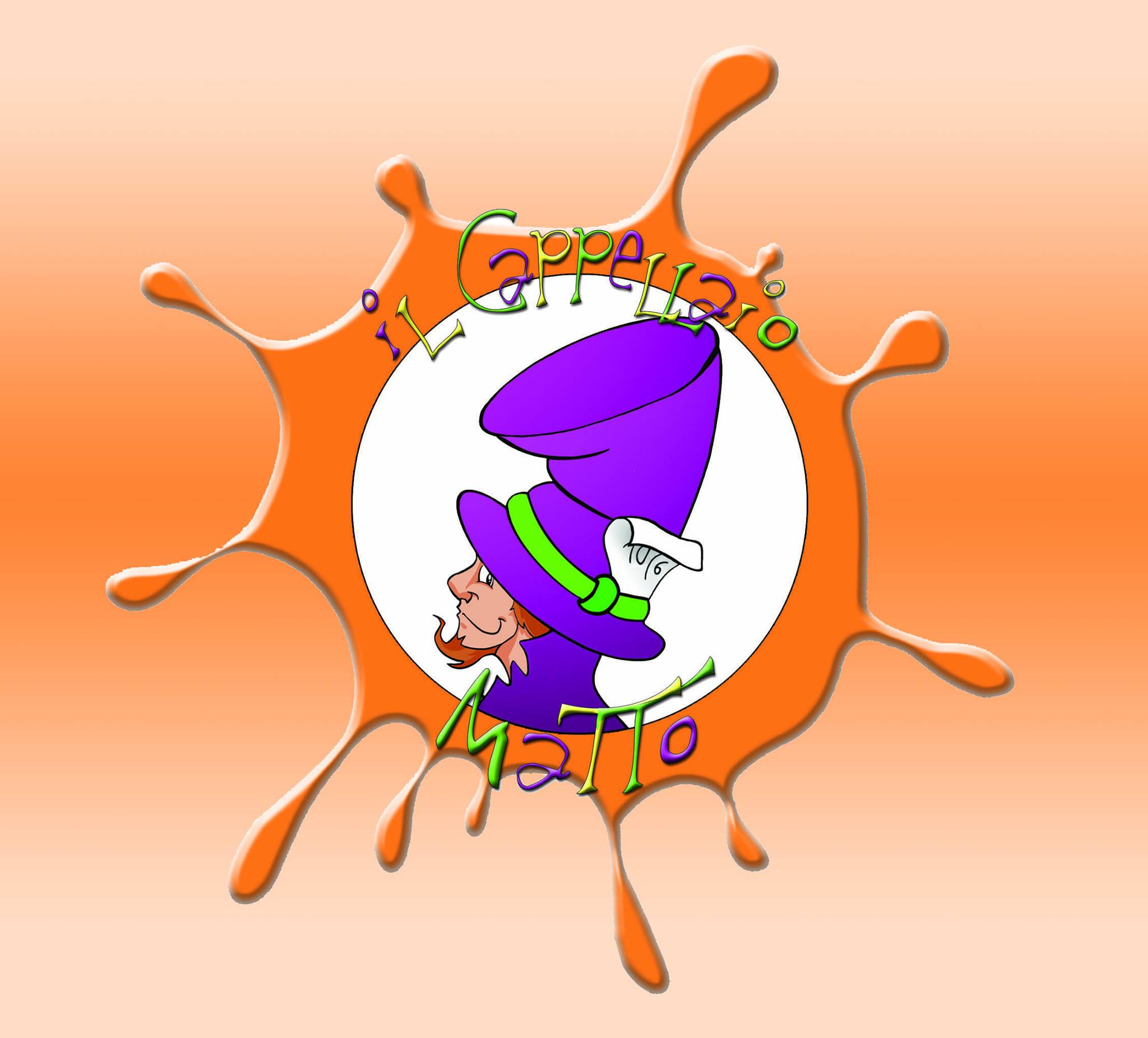
A mio parere c’erano diversi punti validi da tenere fissi, come ad esempio l’impostazione circolare, o la sagoma del personaggio che da sempre ha contraddistinto l’attività.
Anche i colori, sebbene rivisitati nelle loro sfumature sono rimasti più o meno gli stessi.
È una cosa fondamentale secondo me quando si ripensa ad un logo riuscire a creare qualcosa di nuovo (non sarebbe se no necessario il restyling) ma allo stesso tempo mantenere una continuità con il vecchio. I clienti devono riuscire a leggere questa continuità: è importante per non perdere identità non rinunciando però a un rinnovamento in alcuni casi decisamente necessario.
Quello che secondo me era primario cambiare era l’aspetto un po’ “fumettoso” del tutto, che rendeva il logo molto più adatto ad un target esclusivamente infantile.
La prima cosa che ho fatto è stato rendere il personaggio una sagoma, questo è molto utile soprattutto nella stampa in piccole dimensioni, dove non si va a pasticciare troppo con dettagli che risulterebbero illeggibili.
Ho provato a rendere il tutto un po’ più moderno, con caratteri allegri ma puliti e rendendo il nuovo logo una sorta di timbro, con l’inserimento delle icone tazzina e teiera, caratteristiche del personaggio del cappellaio matto, riprese poi nel pattern.
I colori hanno subito un po’ di modifiche invece, pur restano i toni fedeli all’originale. I primi proposti erano, come amavo definirli “sorbettosi”, ricordandomi molto i gelati estivi alla frutta. Siamo poi arrivati a delineare la palette definitiva rendendo alcuni colori un po’ più saturi.
Un’altra cosa su cui abbiamo lavorato parecchio è stata il pay off. La tagline che accompagna il logo e che in un breve motto deve riuscire a descrivere l’attività. Non è stato facile perché ogni frase sembrava precludere qualcosa. Abbiamo poi optato per party planner: ci è sembrata la scelta più aderente con il percorso che Il Cappellaio Matto si è delineato in questi anni.

Per Il Cappellaio Matto ho poi realizzato le t-shirt per gli animatori, i volantini pubblicitari e sono in fase di realizzazione anche gli inviti personalizzabili per le feste.
Da ormai qualche mese è anche online il nuovo sito web (www.ilcappellaiomatto.it), che non ho realizzato io ma dove ho delineato le linee guida per la grafica.

Che altro posso raccontarvi? Beh, è stato un lavoro davvero molto interessante, che sono stata veramente felice di realizzare. Il boss di tutto questo è davvero un tipo tosto, e anche se in alcuni momenti un po’ testardo è sempre bello e stimolante avere confronti così con il cliente.
Direi proprio un cliente quasi ideale, con cui il confronto è stato totale e molto costruttivo. Pronto ad accettare il cambiamento e i consigli, ma molto attento a tutti gli aspetti; in grado di valutare il minimo dettaglio senza perdere di vista il complesso.
Non posso che dire: grazie Cappellaio Matto per avermi dato questa opportunità!![:en]Almost a year ago a dear friend of mine asked me to think over his activity’s logo and today I would like to show you the work done.
Just to be clear, this work did not take me an year it’s only that I did not publish it on the blog yet.
“Il cappellatio matto” (literally The mad Hatter) is an animation agency, mainly for kids but is starting to approach also the adults.
They are a group of young animators which with their fantasy and joviality make parties more funny and special.
The initial logo which I started to work on was this one:
In my honest opinion there was some valid points to keep fixed, as in example the circular form and the outline of the character that characterize the activity. Also the colors, even though with some changes in the shades, have been more or less the same.
The most important thing to keep in mind when you want to review a logo is to be able to create something new but at the same time keep a sort of continuity with the old one. Final customer must be able to feel and read this continuity: it is important in order to not lose the identity without sacrificing renovation (sometimes necessary).
Primary for me was to change a bit the “comics” appearance which made the logo oriented to a childish target.
The first thing I did was to turn the character into a shape, this is very useful especially for the small size printing because in that way you can avoid to add details that would be unreadable.
Then I tried to modernize the entire logo by adding some joyous but clean types, the small cup, the teapot (typical for the character). All that helped to turn the new logo into something similar to a stamp. I also changed the shade of the colors.
Another thing on which we worked on a lot was the pay-off. It was not so easy and then we chose for the “Party Planner” because is the definition that more than other represent the road covered by the “Cappellaio Matto” during the last years.
After all that I realized the t-shirt, fliers, and the customizable invitation to the parties.
For a few months is online the Cappellaio Matto’s website (www.ilcappellaiomatto.it) for which i took care for the graphic guide-line.
What else I can say.. it was a pleasure work with the Cappellaio Matto’s staff and his boss. Although he is sometimes stubborn he is also an open mind and was interesting and stimulating confront with him. For all of that I can do no other than say Thank you Cappellaio Matto for giving me this chance.[:]