[:it]Come è nato sleektips[:en]How sleektips was born[:]
[:it]In questo post vorrei parlarvi del marchio di questo blog. Com’è nato e cosa ci sta dietro!!
Sono innanzitutto partita dalla scelta del nome. Sleektips. Tutto ha avuto inizio una notte di qualche mesetto fa. Avete presente quando vi mettete a letto ma non riuscite a dormire perché la vostra testa corre? Era qualche giorno che pensavo di iniziare a scrivere un blog: perché adoro il mio lavoro e perché mi piace scrivere. Mi sembrava un ottimo connubio. E quella sera nello specifico stavo pensando a come avrei potuto chiamarlo. Non volevo usare il mio nome, perché mi sembrava poco riconoscibile e memorizzabile, ho iniziato quindi a giocare con la parola tips, visto che in fondo il mio scopo è dare piccoli consigli sulle cose che meglio conosco. Ho iniziato ad associargli aggettivi e parole che potessero rafforzare la mia idea. E qui arriva sleek. Letteralmente raffinato, elegante. Perché alla fine non voglio dare consigli di vita! Vorrei dare consigli di stile! Qui è nato tutto. Mi è subito piaciuto come suonava la combinazione di queste parole e da li non l’ho più abbandonato, nonostante abbia fatto molti altri ragionamenti su molti altri nomi.
Per quanto riguarda invece la veste grafica, ho subito deciso che avrei voluto associare un pittogramma al logo. Per quelli di voi che magari sono meno esperti nel settore il pittogramma è l’immagine mentre il logo è la scritta del nome. Insieme compongono il marchio. Ecco un piccolo schema.
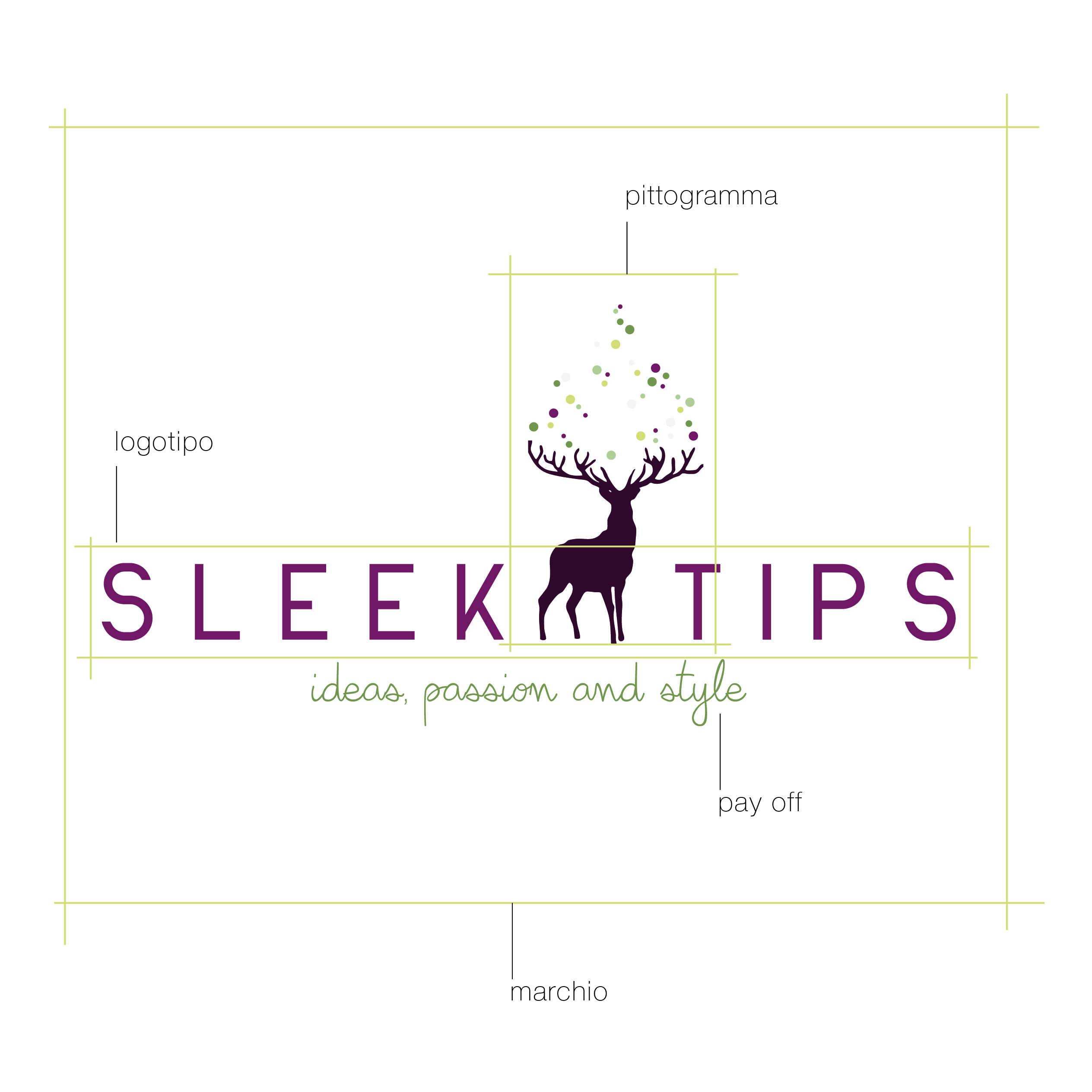
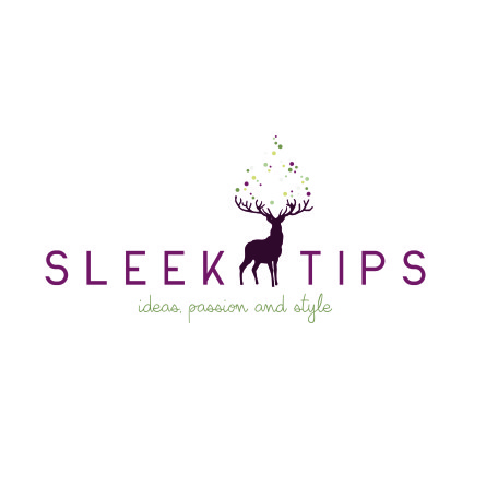
Ho deciso di inserire la sagoma di un cervide. Non è una scelta casuale, ma molto pensata. Innanzitutto mi sono sempre piaciuti moltissimo. Credo la renna sia il mio animale preferito in assoluto. E poi vogliamo parlare della loro maestosità? Il portamento “altezzoso”: con il collo eretto e la camminata elegante… mi sembravano perfetti per rappresentare la parte “sleek”. Con i loro palchi ramificati poi come si può non associarle alla saggezza?
Ho pensato così di far uscire dai loro palchi una serie di bolle di colori diversi, un po’ a simboleggiare dei pensieri che escono.
Sono poi passata al logotipo, ho fatto molteplici prove con svariati font, e credo di aver trovato quello giusto in quello che vedete. Anche la posizione rispetto al pittogramma ha subito svariate prove e modifiche. Non pensate che l’ideazione di un logo sia un’idea che arriva all’improvviso e si concretizza nel primo disegno che realizzate. Sono necessari un sacco di aggiustamenti e molte molte prove prima di arrivare ad un risultato in cui nulla più potete togliere o aggiungere per migliorarlo.
Ho scelto poi una serie di colori che penso rappresentino al meglio il mio messaggio.
Ecco qui quindi la mia scelta finale.
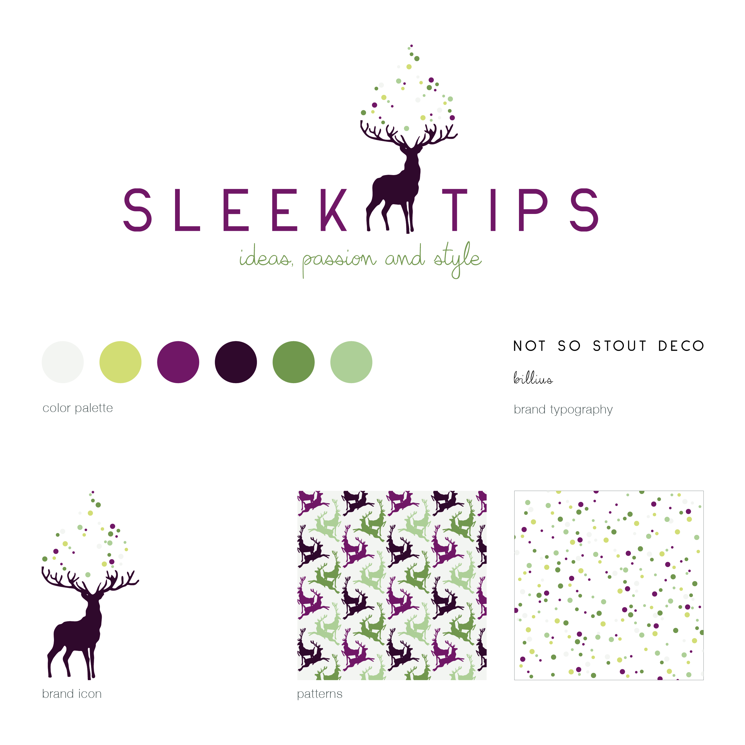
Che ne dite? Vi piace?[:en]In this post I would tell you about the brand of this blog. How it was born and what there is behind it.
First of all I’ve started with the choice of the name. Sleektips. All started some months ago night-time. Do you know when you are in the bed trying to sleep but you can’t because your mind is running? I was thinking since some days to begin to write a blog: because I love my work and because I do like writing. It seems a real good bond, isn’t it? On that night specifically I was thinking how i could have call it. I didn’t want to use my name, because it seemed me less recognizable and not easy to recall, so I’ve tried to play with the word “tips”, considering that my aim is to give advices regarding things I know best. I’ve started to associate adjectives and words that were able to strengthen my idea. And here arrives sleek. Literally polished, elegant. Because in the end I don’t want give life advices! I would give style advices! Here all is born. Since the beginning I liked the sound of these words together and I haven’t changed my mind, although I did a lot of thinking about a lot of other names.
Regarding the graphic interface, I immediately decided I wanted to add a brand icon. Small bracket for the beginner: the brand icon is the image, while the logotype is the written of the name. Together they compose the brand. Here you can find a sketch.
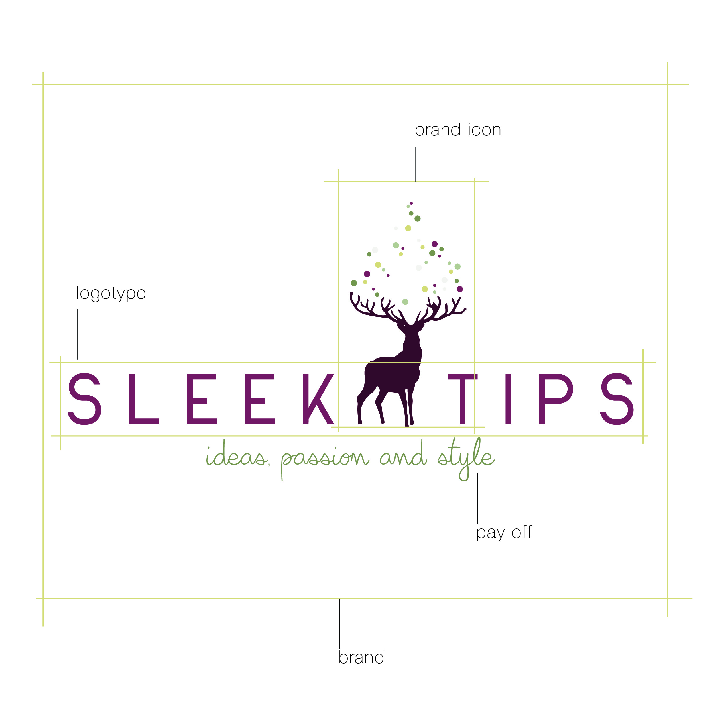
I’ve decided to put the shape of a Cervidae. It isn’t a random choice but thought deeply. First of all I really love them. I believe the reindeer is definitely my favorite animal. And, do you want to talk about their majesty? Their “haughty” posture: with the erect neck and the elegant gait… they seem me perfect to symbolize the “sleek” part of the name. With their antlers, how cannot you think about they wisdom?
It seemed to me perfect to overflow from their antlers a series of bubbles in different colors, to symbolize the thoughts that come out.
Then I focused on the logotype, I made various attempt with a lot of fonts, and I think i have found the right one. Also the position of the written part in relation to the image has experienced several tests and changes. You don’t think the brand design is an idea that suddenly arrive and materialize in the first sketch you make. A lot of adjustments are necessary and you need to do a large amount of test before arrive at a result where there are nothing you can add or remove to improve it.
I chose a color palette that I think better represents my message.
This is my final choise.
What do you think about it? Do you like it?[:]